Increasing number of used care sales
I worked in the company as the ux/ui designer for the timeline of the project. The position involved UX research with the marketing team, A/B testing with the marketing lead, UI design and refining the design system with different colors, typefaces and styles in the design system.
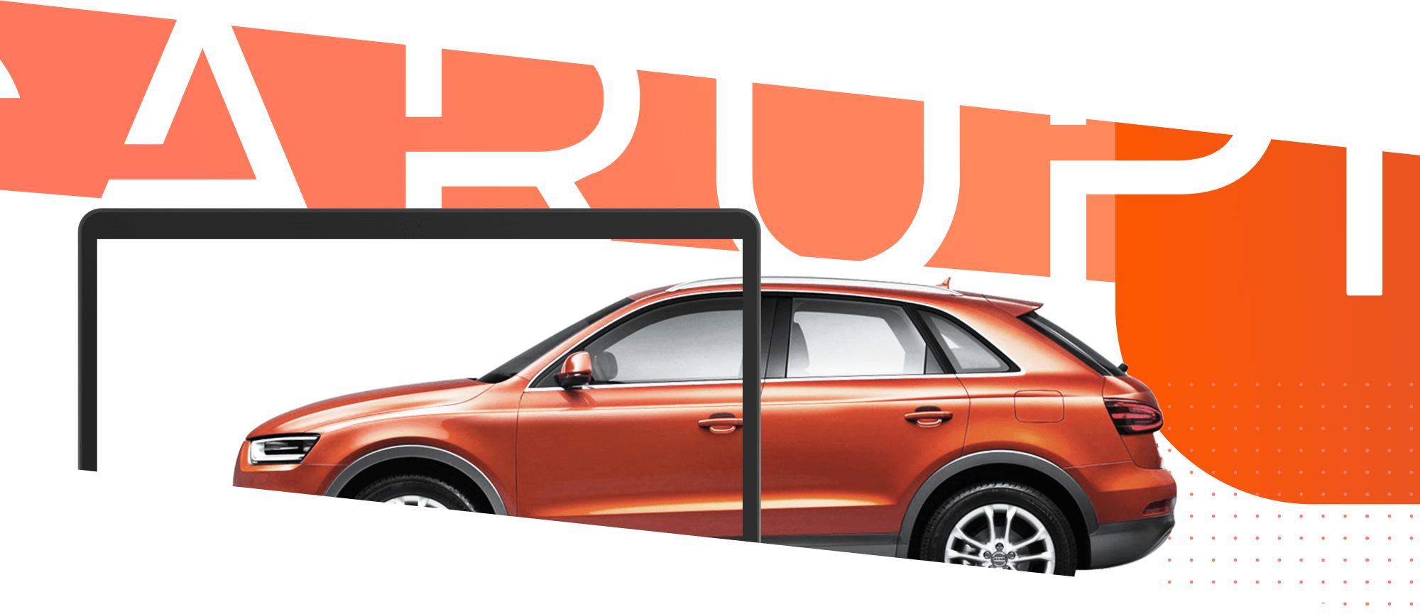
Carupi is a succesful online used car market. It gained prominence for becoming the first and the best product in their market niche on Product Hunt. The positive aspect of the business was that there was a lot of people buying used cars, especially during COVID because everything was handled hassle-free online. The problem was reaching sellers. Their cars had to be checked and verified, with photos and in-person. How do we attract more sellers AND more buyers into the ecosystem? Speed was a big factor of this project and iterations had to be pushed for testing daily.
Our high level goals were to:
During the research phase, I helped brainstorm and establish the userflow logic. The brand had to be refined so I spend a lot of time in visual design and improving brand guidelines. My responsibility was to rebuild key website areas through research and design to produce a better experience for our target audience. I also created a lot of user journey mapping all the way to final design.
During the research phase, the marketing lead and me mapped out user painpoints on the website and possible solutions. During the ideation phase we also used input from existing customers on a qualitative analysis to establish what possible solutions could be. A lot of research was done in building the user persona especially for car sellers and it evolved as time passed. I contributed to the information architecture design, and was responsible for rebranding the website with the marketing & dev team in Figma. My final output was finished designs for almost all parts of the website and interactions. Finally, I also built numerous usable interactive prototypes that were used to conduct studies on Hotjar.
Sellers vs Buyers in the user pool have to be in equilibrium. One should not be more present than the other. How do we communicate to both groups that satisfaction of one does not come to the detriment of the other? Used car sellers and used car buyers in the real world often treat each other almost as enemies. How do we change that?
Our main findings include:
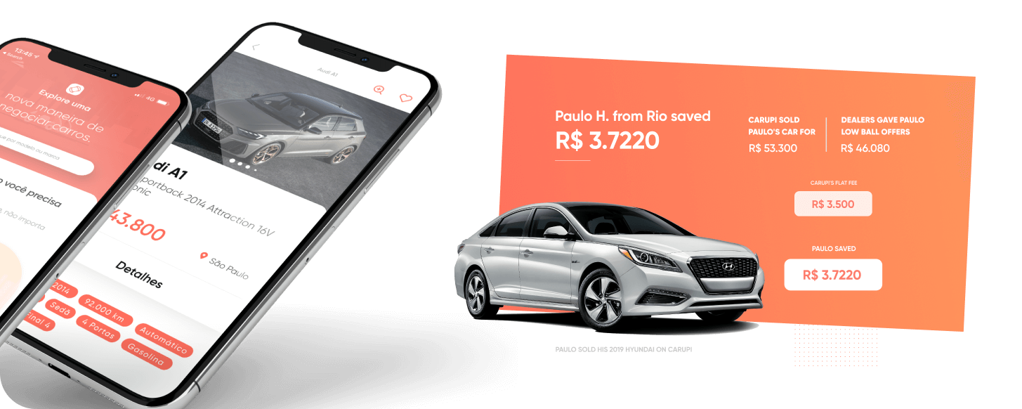
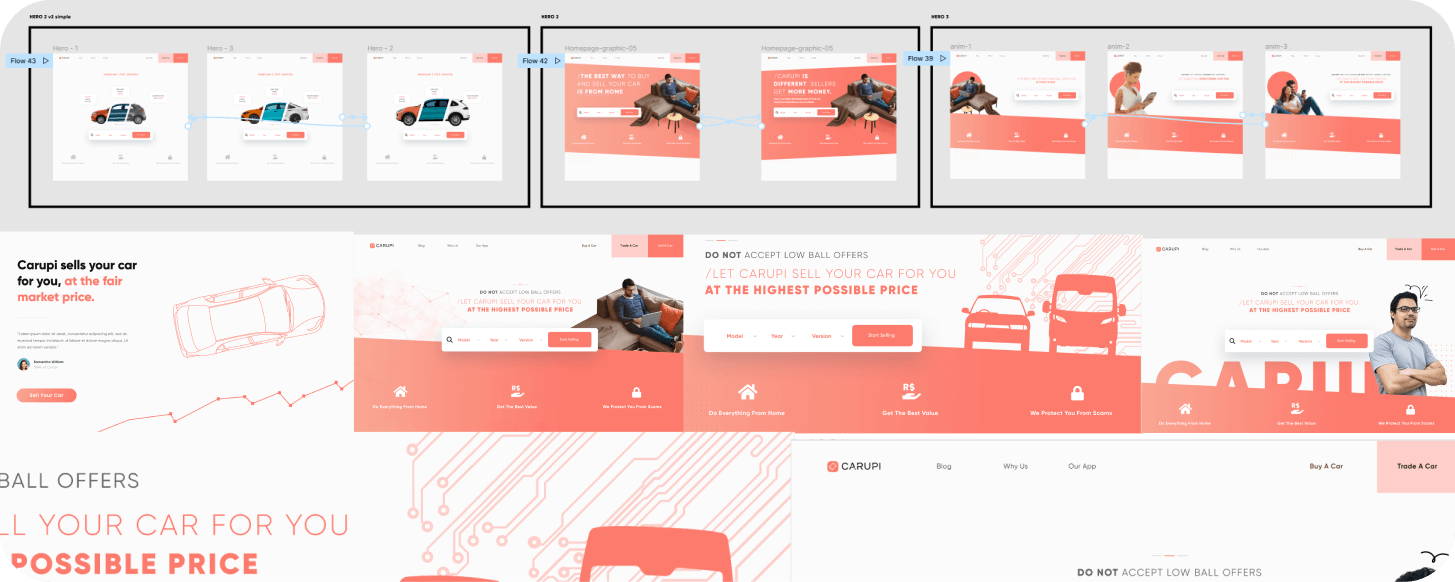
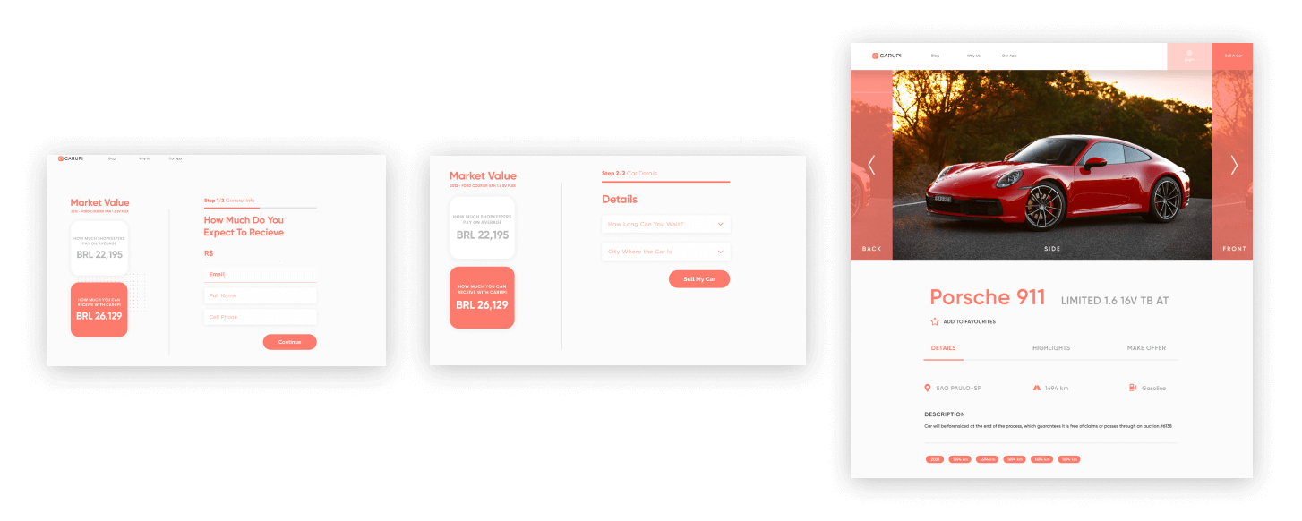
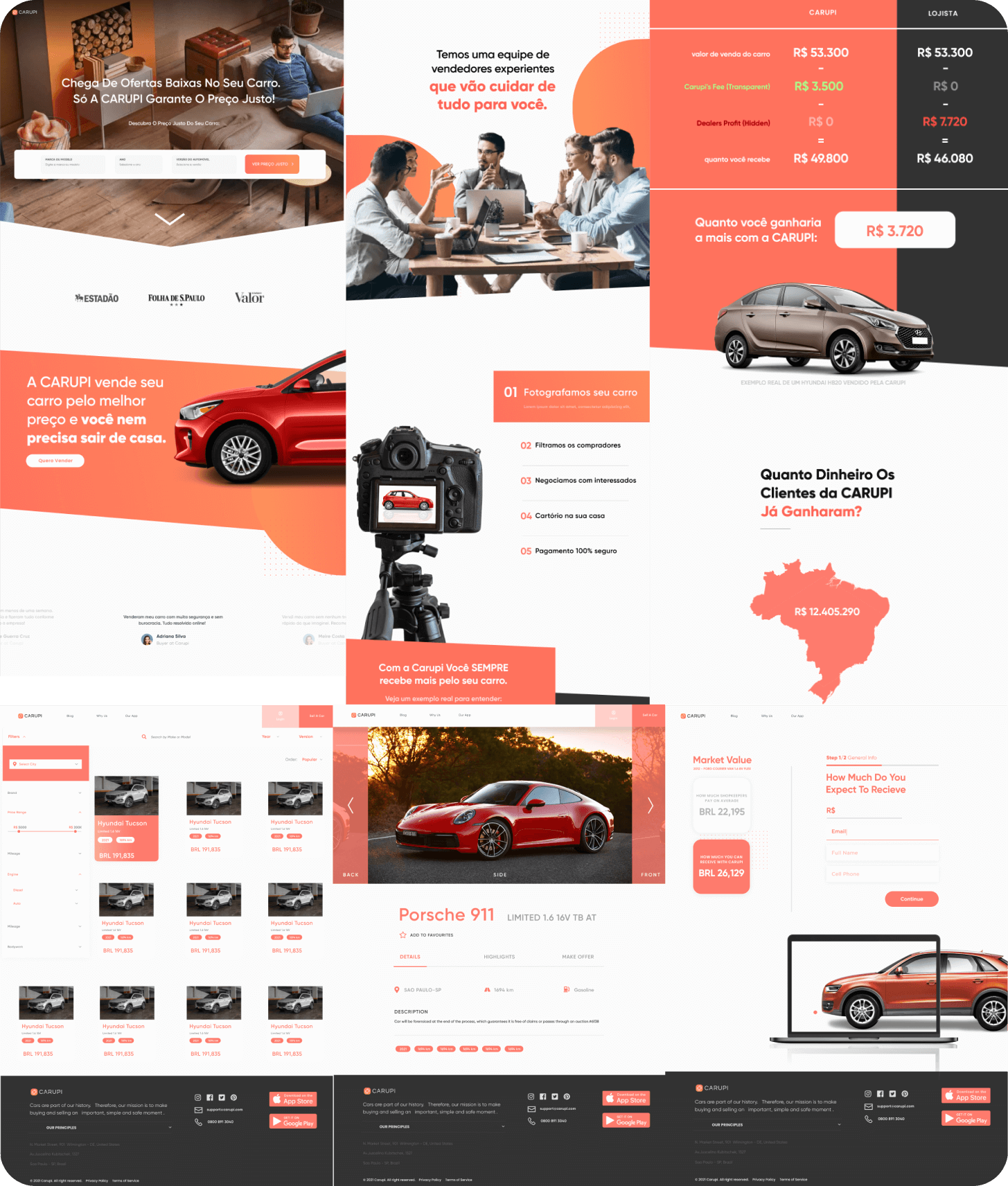
The results motivated us to reword the existing website copy and introduce more interactive elements. The homepage became the epicenter for searching cars in an elegant and filterable manner. We decided to break apart the website homepage into two scenarios which we made user journeys for. One is for buyers and one for sellers. They are infographics accompanied by specific examples of the whole selling process with a modal on how much specificly users save. Instead of just testimonials - we built in depth examples.
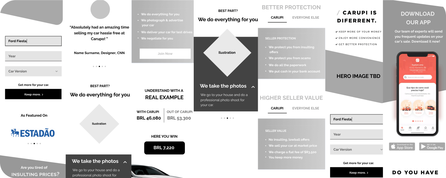
In order to communicate with shareholders and company leaders early on we would moodboard what we liked and why. We used that logic to also implement a QA analysis which I led. Main problems with visual hierarchy included changes for better SEO, CTA amplification, simplifying the layout and much more.
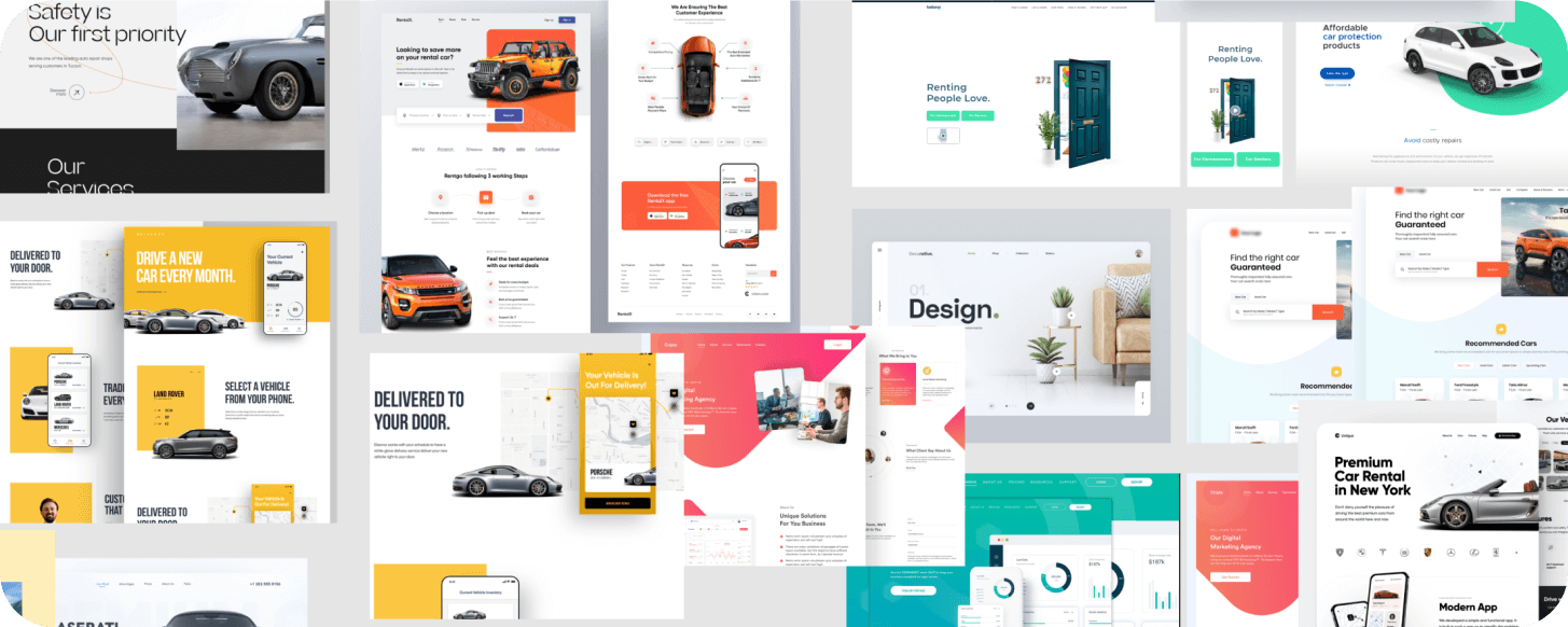
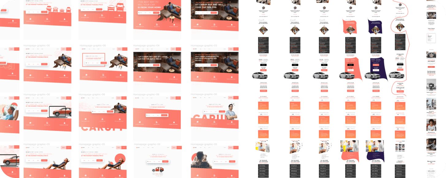
A big part of the project was creating interactive prototypes and motion design to accompany it to A/B test with users. We would gather all the information + targeted heatmapping to see how users navigate. Over 20 iterations later we arrived at a satisfactory product. The website also had to work in both english and spanish so we had to divide our tests around different geo-locations online.
While talking to users, we decided to redo the sign-up flow and car listing page as well. We wanted to take as little information as possible and keep the sign up process as light as possible.
Once we did all the tests I proceeded to redesign a lot of the userflow and visual language of the rest of the platform. This included visual design, typography, layout, overall visual style and more.
HTML5 Ads Promo material UI UX Interactive prototypes visual design typography logo branding
Adobe Suite Figma google web designer