Improving choicemaking
I worked in the company as the lead designer for 2+ years. The position ranged from UX research with the marketing team to design and collaboration with print studios, dev teams while communicating with third parties and company leaders. Everything visual from html5 ads and digital design to print material and social was designed by me. I also built their design system from scratch.
Science.bio handles a lot of sensitive and context complex products. They go through rigorous third party testing. The specific industry requires a lot of trust from customers to receive high quality products. Our focus was to showcase how trustworthy the brand is and inform users about each product sufficiently. With a wide array of 200+ products, how do we achieve that?
Our high level goals were to:

During the research phase, I conducted a literature review on the products the company offers and semi-structured interviews with potential users During the ideation phase, most of the proposed ideas were implemented with the collaboration with the CEO. I contributed to the information architecture design, and was responsible for rebranding the website with the dev team in Figma. My final output was also a complete rebrand of the company. Finally, I ended up becoming their in-house designer, working across all levels of design from print to animation and website design.
To better understand the problem space, we conducted a literature review and a competitive analysis. For the competitive analysis, we focused on life science research products and consumer health products for the general population.

Our main findings include:
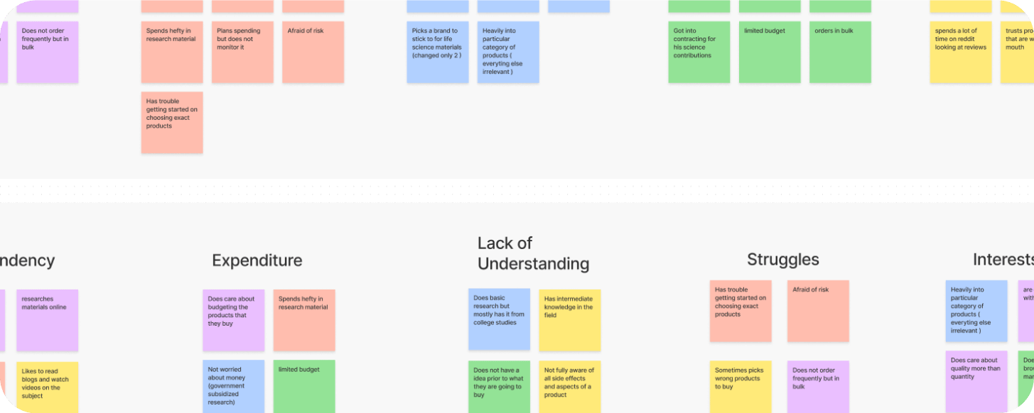
The results motivated us to focus on customers that are active in the community online to learn about their barriers when purchasing products. We narrowed it down to young adults & middle-aged tech savvy customers researching the topics of longevity, life sciences and future of health. We also realized there were many aspects of the brand (speed of delivery, testing and more) we can accentuate through design to reinforce it's qualities. I created a quick affinity map while talking to users to serve as a guide through the process as well as user personas.
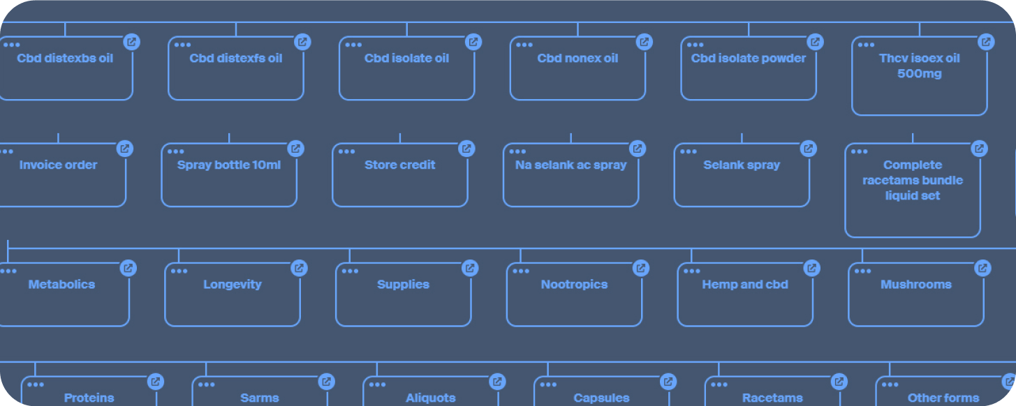
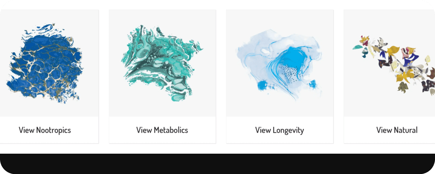
We quickly realized that we need to build hierarchies within our product categories. Thus through research of 200+ products and a lot of back and forth as a team we built multiple categories: metabolics, nootropics, longevity, botany and misc products. Visually we wanted to try out something new and interesting, abstract and inviting patterns we find in nature. These were later vectorized and built.
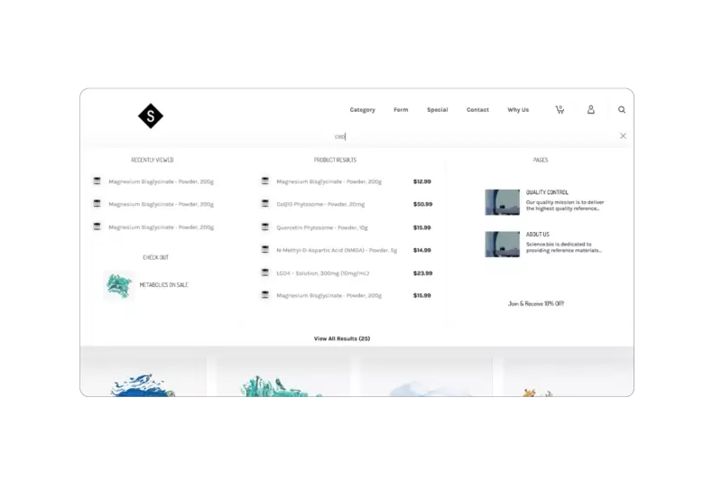
During our initial interviews, we found that users have a difficulty navigating the website. Searching through a wide array of wildly different products can be difficult even with present categories. We then A/B tested different search functions, and different broad categories (best selling, popular and similar). We reiterated with 4 different versions until reaching a solution that users preferred to the original.
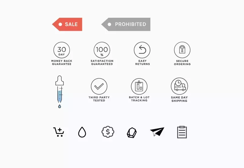
Through 4 different redesigns, we did controlled A/B testing on how to showcase company delivery speed, quality of third-party testing and quality of products. Most users spend their time on the homepage and on a specific product page. They get to those pages using google search. We then realized we have to showcase reafirmings qualities in the homepage header and in every product page. These include rigorous testing, delivery speed, user satisfaction and refund policy.

During the project due to my experience in print and branding I also redesigned the labels and every aspect of packaging and renders.
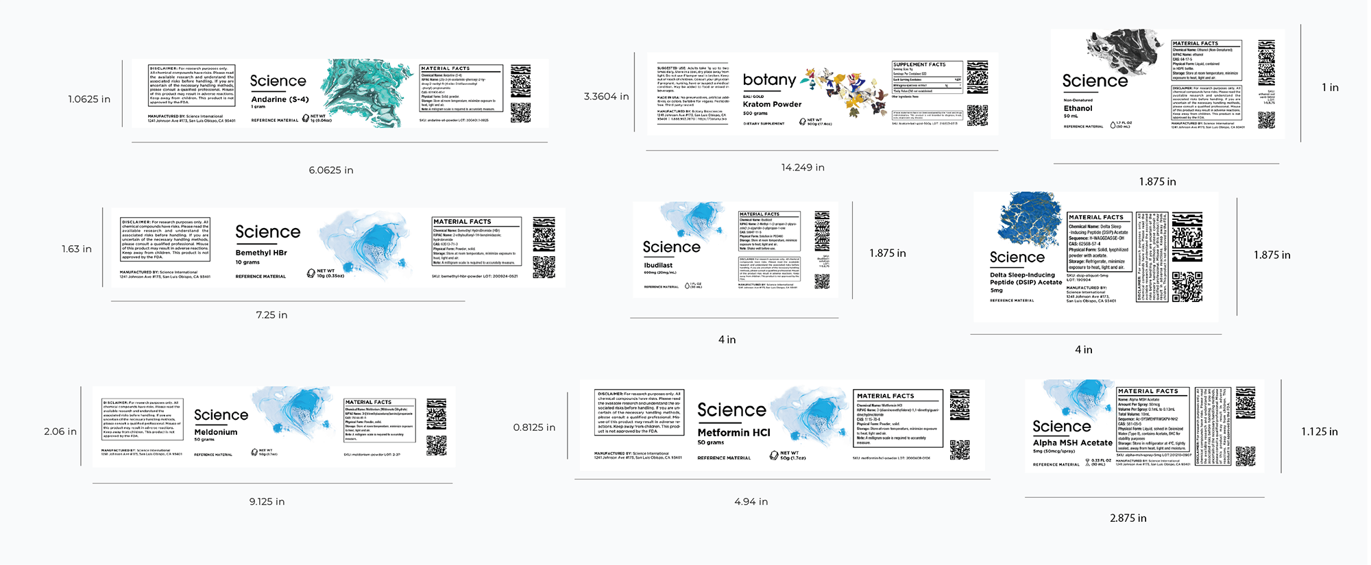
After the specific task was done I remained for another year as the lead designer in the company, rebuilding the typography, creating new labels and redesigning the brand trying to visually elevate it and differentiate from competition in a way that is true to the rules of composition, design and color.
We understood users had limited budget and needed reassurance for product quality and legitimate pricing. Together with that, offering a place to learn about the product and improving the search increased the number of sales and bulk orders on the website.
HTML5 Ads Motion Design Promo material UI UX label design 3D rendering file organization visual design front end coding typography logo branding
Adobe Suite Figma wordpress visual studio code google web designer blender 3d