Building a Platform

I worked in the company as the ux/ui designer for the timeline of the project. The position involved UX research with the founders, ui design, userflows, journey maps, design systems, illustration and so much more. My responsibility was also to conceptualize a workflow between the dev team, founders and myself so that we can implement code and design changes quickly for testing.
SolveOnline needed to build a platform. They had most of the usecases and rough wireframes ready. What we needed to do was to jump into creating an information architecture, user flows and finally design that we could test and reiterate when necessary.
Our high level goals were to:
During the research phase, I established an internal company workflow as well as helped beter define our long term and short term goals . I had to implement the existing brand assets into a brand ecosystem while also changing up key aspects for better funcionality. My responsibility was to take the whole platform design to the final phase together with all the possible assets necessary. Additionally, we would regularly test our designs and create iterations due to the challenge of simplifying a very complex system.
During the research phase, the founders and me brainstormed an information architecture and userflows. During the ideation phase we also had to adress predictable painpoints in the website due to information overload in the layout. I contributed to the information architecture design, and was responsible for rebranding the website with the founders & dev team in Figma. My final output was a finished design for almost all parts of the website and interactions. Finally, I also built numerous usable interactive prototypes that were used as a test environment.
We had to seperately design a different user scenario that involves the business user scenario. This required special modals, a dedicated dashboard page and iterations to the way the user navigates.
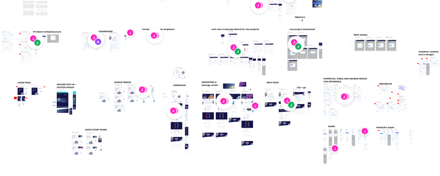
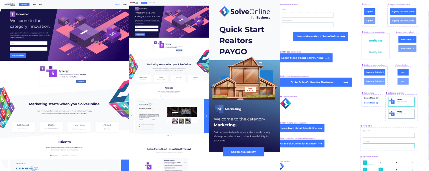
When we started creating our design system and different aspects of the SaaS product, we quickly realized we would have to plan ahead. A lot of modals, buttons, typography would be overwhelming for such a big project. We mapped out all possible complexities on any given page could have and used that to create interactive prototypes to test with users and between each other.
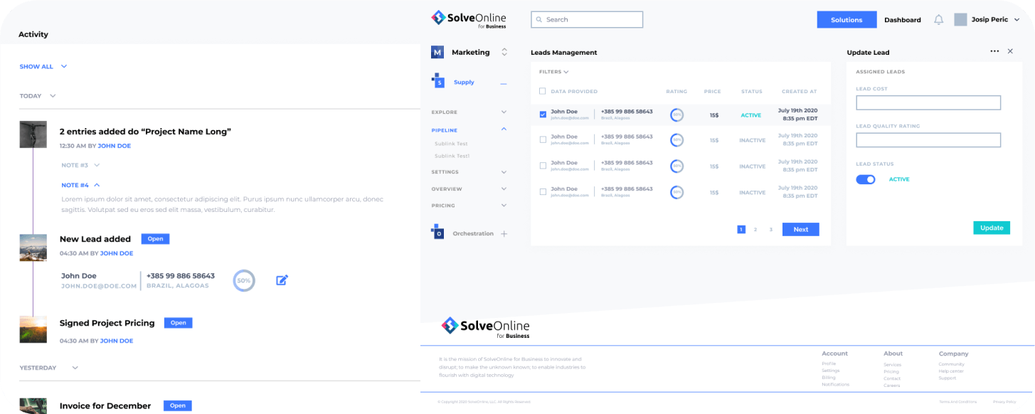
Some pages were overflowing with options and capabilities for users to track all kinds of different scenarios of the product. To alleviate that, we introduced multi-level modals that A/B testing showed increased interaction precision for user navigation.
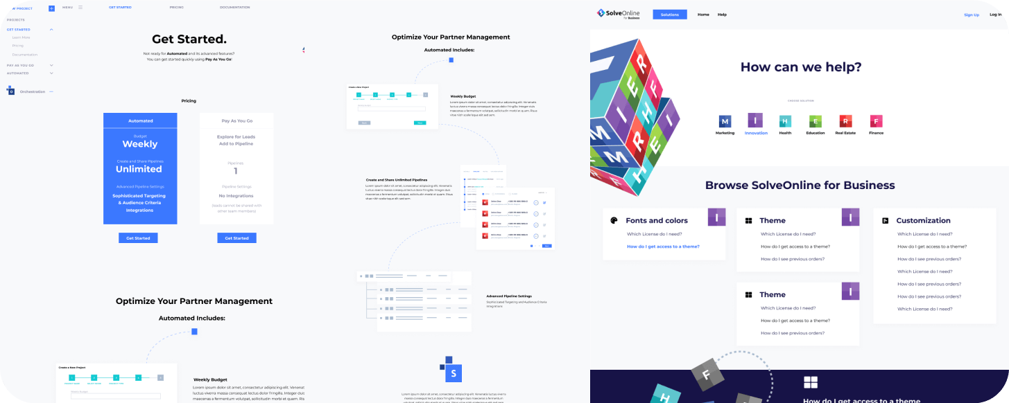
While design is a process with a lot of back and forth, we progressed to design the whole system. One painpoint was the homepage which had to explain to users what we are offering. This time we introduced a lot of visual design and copy iterations to test and find the best results.
HTML5 Ads Promo material A/B testing Heatmaps UI UX Interactive prototypes visual design typography Illustration Design Systems
Adobe Suite Figma google web designer